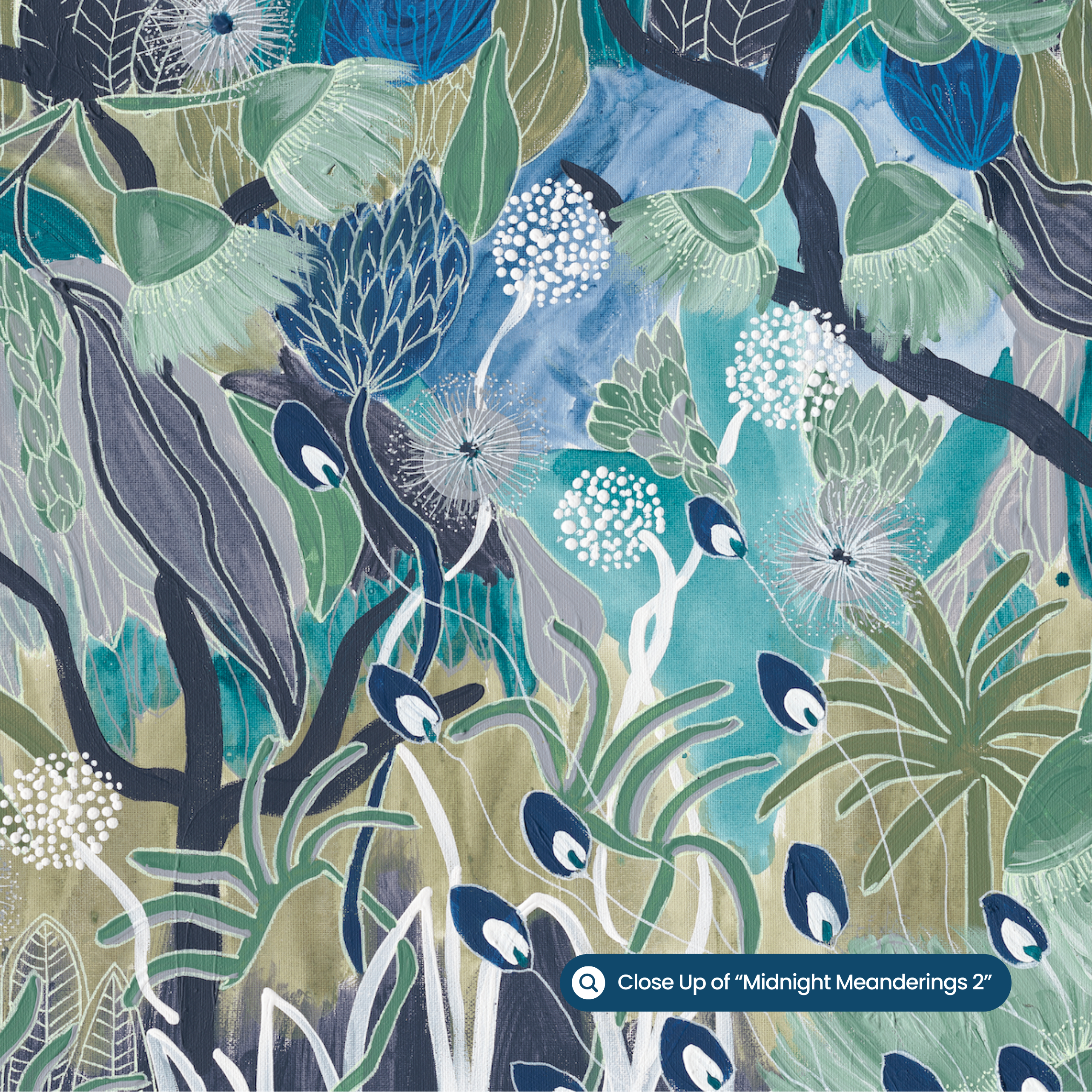
Article: How to Choose the Right Colour Artwork for Your Room: A Stylist's Guide
How to Choose the Right Colour Artwork for Your Room: A Stylist's Guide
Choosing the colour of your wall art is, hands down, one of the most exciting (and slightly nerve-wracking!) parts of decorating a room. Get it right and your whole space comes alive. Get it a little bit "off" and the piece can feel like it's floating in the wrong house. So this guide is here to help you confidently choose an artwork colour palette that works with your room instead of fighting it. As always, treat it as a guide rather than a strict rulebook, because when it comes to choosing art, gut feel always wins.
And if you'd love a second opinion, you can email me a photo of your room and the artwork you have your eye on, and I'll pop it onto your actual wall with a FREE MOCK-UP. Email me at hello@annalohe.com. Easy as that.
Why Colour Matters More Than You Think When Choosing Art
Colour is the very first thing your eye registers when you walk into a room. It lands before the pattern, before the subject, before the size. It sets the mood. A soft, earthy palette will calm a space and make it feel grounded. A pop of pink or a zing of citrus will lift it and bring the energy. Neither one is "right" or "wrong". It all comes down to the feeling you want to walk into.
The good news? You don't need to match your art to your cushions like you're colour-coding a wardrobe. In fact, please don't! The most beautiful rooms have wall art that talks to the colours around it rather than copying them exactly.
Step 1: Decide on a Feeling, Not Just a Colour
Before you fall down the rabbit hole of paint swatches, ask yourself one simple question: how do I want this room to feel?
Calm and restful. Lean into earthy tones, soft blues, sage greens and warm neutrals. Perfect colours for bedroom artwork, reading nooks and anywhere you want to exhale.
Energetic and joyful. Reach for pinks, corals, citrus and bold botanical greens. Wonderful for entryways, living room art and home offices where you want a lift.
Grounded and sophisticated. Think deep earth tones, terracotta, ochre and muted blues that add richness without shouting.
Once you know the feeling, the colour family almost chooses itself.
Step 2: Look at What's Already in Your Room
Your room is already giving you clues for choosing wall art colours. You just have to look for them. Take a slow scan of:
Your big anchors. The sofa, rug, bedhead and curtains. These set the base palette.
Your fixed elements. Timber floors, benchtops, tiles, and the warmth or coolness of your whites.
Your existing accents. Cushions, throws, vases, books, and that one ceramic you can't part with.
You're not trying to match all of these. You're really just looking for the overall temperature of the room (warm or cool) and one or two colours you'd love to echo or gently contrast in your artwork.
Bountiful Garden adds joy to the room and works with existing furniture.
Step 3: Use the 60-30-10 Rule (Loosely!)
Interior designers love the 60-30-10 rule, and it's a lovely place to start when planning a room's colour scheme:
- 60% of your room is your dominant colour, usually the walls and large furniture.
- 30% is your secondary colour, like rugs, curtains or a feature chair.
- 10% is your accent, and this, my friend, is often where your artwork comes in.
Your art can be that joyful little 10% that pulls the whole scheme together. It's exactly why a colour-pop print works so beautifully in an otherwise neutral room. It becomes the hero instead of getting lost in the noise.
Step 4: Match, Echo or Contrast — Pick Your Approach
There are really only three ways to play it when matching art to your room, and honestly all three can look stunning.
1. Echo a colour already in the room. Pull a colour from your rug, your cushions or a hero object, and choose art that features it. This creates a lovely sense of harmony and intention, so the piece looks like it was always meant to be there. You don't need the exact shade either — the same colour family is plenty.
2. Contrast for impact. Have a neutral, calm room? A bold, colourful artwork becomes an instant focal point. This is my favourite approach, because a confident splash of colour against soft walls is pure magic and gives a room real personality. (This is where colourful prints really shine in a neutral space.)
3. Go tonal for a calm, considered look. If you love a serene, layered feel, choose art in the same tonal family as your room. Earthy on earthy, soft blue on soft blue. The effect is sophisticated and soothing, and the texture and brushstrokes get to do the talking.
Abundant Dance echoes the golden colours of the sofa cushions.
Step 5: Mind the Undertones
Here's the little detail that trips people up when choosing artwork colours: undertones. Two "beige" walls can be worlds apart. One can be warm and pinkish, the other cool and grey. The same goes for greens (olive versus mint) and blues (warm denim versus cool sky).
The trick is to keep your warm tones with warm, and cool with cool, unless you're deliberately going for contrast. If your room is full of warm timbers and creamy whites, an artwork with warm, earthy or sun-drenched colours will feel right at home. If your space leans cool and crisp, cooler blues and greens will really sing.
When in doubt, hold the artwork (or a printout) up in the room at different times of day. Light changes everything, and a colour that looks perfect at midday can shift completely by evening.
A Quick Colour Cheat Sheet by Room
Use this as a springboard, not gospel. Your home, your rules:
| Room | Try this palette | The feeling |
|---|---|---|
| Bedroom | Soft blues, earthy neutrals, blush | Calm, restful, restorative |
| Living room | Botanical greens, warm pinks, earthy pops | Welcoming, full of life |
| Entryway or hallway | Bold, joyful colour | A confident first impression |
| Home office | Energising citrus, fresh greens, blue | Focused but uplifting |
| Bathroom | Fresh blues and greens | Spa-like and serene |
Shop Limited Edition Prints by Colour
To make life easier, I've sorted my limited edition prints by colour so you can shop straight to the palette you love:
- Pink artworks — joyful, warm and full of personality.
- Earthy / earth tone artworks — grounded, tonal and forever in style.
- Blue artworks — calm, coastal and easy to live with.
- Green artworks — fresh, botanical and full of life.
- Australian Botanicals — native flora with energetic freshness.
Have a browse through the colour collections on my website and you'll quickly get a feel for what speaks to you and your space.
My Best Tips Before You Commit
Trust the feeling first. If a colour makes you happy every time you look at it, you're already most of the way there.
Don't over-match. Art that echoes your room, rather than copies it, always looks more considered.
Test in your own light. Pop a printout on the wall and live with it for a day before deciding.
When unsure, let colour be your accent. A bold piece in a neutral room rarely disappoints.
Use my free mock-up. Email me a photo of your room at hello@annalohe.com and I'll show you how different colourways look on your actual wall.
At the end of the day, the "right" colour artwork is the one that makes your heart do a little happy skip every time you walk past it. Choose the piece that brings you joy, and your room will thank you for it.
Happy Decorating
Anna xx
Written by Anna Lohe
%20parts%20of%20decorating%20a%20room.%20Get%20it%20right%20and%20your%20whole%20space%20comes%20alive.%20Get%20it%20a%20litt...)